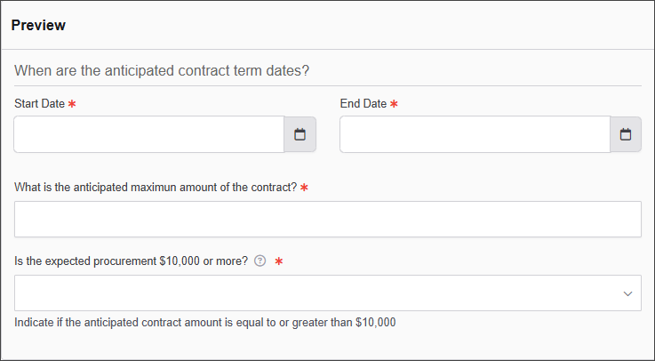
Field Set
The Field Set Component is used to create structured sections within a form, allowing users to group related form elements under a single heading.
The options available to configure the Field Set element are separated into two categories:
-
Display
-
Conditional
Display
| Parameter | Description |
|---|---|
| Legend | A title for the field set that helps identify the grouped elements. |
| Tooltip | Provides additional information about the fieldset when users hover over an info icon. |
| Custom CSS Class | Custom CSS class to add to this component. |
| Hidden | When enabled, the field set is not visible on the form. |
| Disabled | If checked, the field set remains visible but cannot be interacted with. |
Conditional
| Parameter | Description |
|---|---|
| This Component should display | True - the component will display in the form. False – the component will not display. |
| When the form component | Select what component within the form will execute the condition. For example, Submit. |
| Has the value | The data entry of the field that executes the condition. |