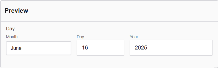
Day
The Day component allows users to select a specific calendar date, typically using a date picker interface. This component is ideal for capturing birthdates, appointment dates, or any event-specific dates within a form.
The options available to configure the URL component are separated into seven categories:
- Display
- Day
- Month
- Year
- Data
- Validation
- Conditional
Display
| Parameter | Definition |
|---|---|
| Label | The name shown on the form for this field (e.g., "Day"). Required. |
| Hide Input Labels | A checkbox that hides the label next to the input element, typically used for a cleaner UI. |
| Description | Additional help text shown below the field to guide users on its purpose or usage. |
| Tooltip | A small message that appears when users hover over an info icon beside the field label. |
| Custom CSS Class | Custom styling class(es) that can be applied to this field for layout or design purposes. |
| Hidden | A checkbox to make the field invisible on the form, useful for conditional logic or storing hidden values. |
| Hide Label | Hides only the label (not the input itself), often used when labels are shown in a different way. |
| Initial Focus | If checked, this field will automatically gain focus when the form loads. |
| Disabled | Makes the field non-editable and visually indicates that it is disabled to the user. |
Day
| Parameter | Description |
|---|---|
| Type | Specifies the type of input, (e.g. Number). |
| Placeholder | Defines a placeholder text displayed inside the input field (e.g., Day Placeholder). |
| Hidden | A checkbox option to hide the input field from the UI. |
| Day First | A checkbox option to set the day as the first element in a date format. |
Month
| Parameter | Description |
|---|---|
| Type of Input | Specifies the type of input, (e.g., Select). |
| Placeholder | Defines a placeholder text displayed inside the input field (e.g., Month Placeholder). |
| Hidden | A checkbox option to hide the input field from the UI. |
Year
| Parameter | Description |
|---|---|
| Type of Input | Specifies the type of input, in this case, a "Number" field. |
| Minimum Year | Defines the minimum selectable year (e.g., 1900). |
| Maximum Year | Defines the maximum selectable year (e.g., 2030). |
| Placeholder | Defines a placeholder text displayed inside the input field (e.g., Year Placeholder). |
| Hidden | A checkbox option to hide the input field from the UI. |
Data
| Parameter | Description |
|---|---|
| Default Value | Defines the default value for the input (e.g., Month, Day, Year). |
| Clear Value When Hidden | A checkbox option to clear the value when the field is hidden. |
Validation
| Parameter | Description |
|---|---|
| Require Day | A checkbox option to make the day input required. |
| Require Month | A checkbox option to make the month input required. |
| Require Year | A checkbox option to make the year input required. |
| Maximum Day | Defines the maximum allowed day value (e.g., yyyy-MM-dd). |
| Minimum Day | Defines the minimum allowed day value (e.g., yyyy-MM-dd). |
| Unique | A checkbox option to ensure the value is unique. |
| Validate When Hidden | A checkbox option to validate the input even when it is hidden. |
| Error Label | Defines a custom label for the error message. |
| Custom Error Message | Defines the custom error message that will be displayed. |
Conditional
| Parameter | Description |
|---|---|
| This Component should display | True - the component will display in the form. False - the component will not display. |
| When the form component | Select what component within the form will execute the condition. For example, Submit. |
| Has the value | The data entry of the field that executes the condition. |