User Field
In Authorium's form builder, the User Field component is used to automatically populate and display user-related information in a form. Instead of requiring the form submitter to manually enter user details, this component retrieves and displays attributes such as username, full name, email, or department.

The options available to configure the User Field elements are separated into four categories:
- Display
- Data
- Validation
- Conditional
Display
| Parameter | Description |
|---|---|
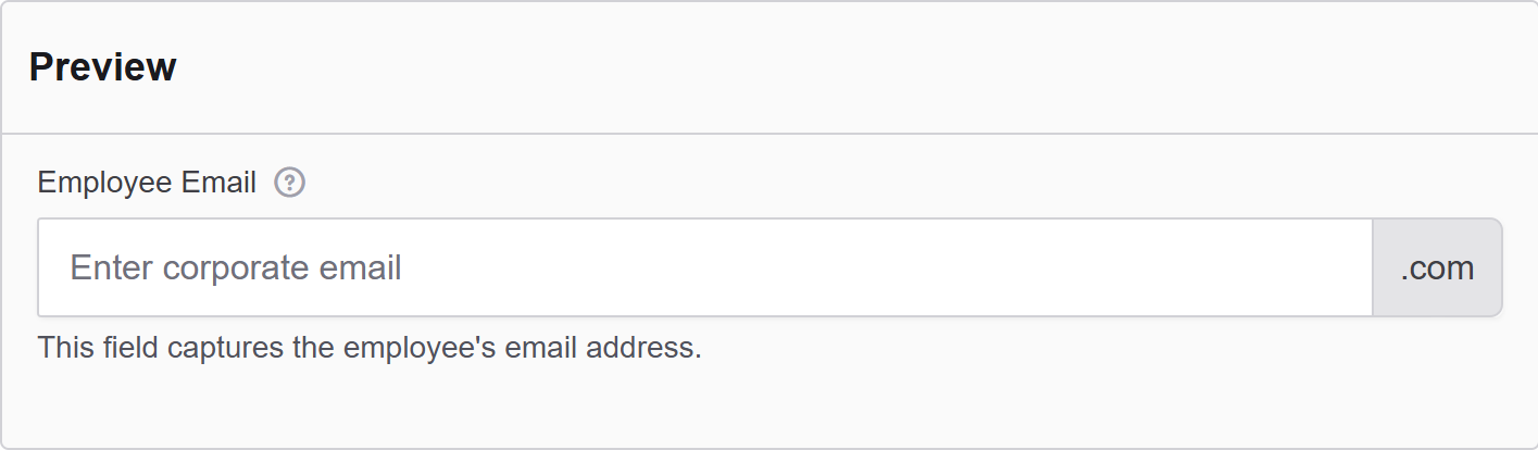
| Label | The label appears next to a form input field and describes its purpose clearly. |
| Placeholder | The placeholder text that will appear when this field is empty. It shows an example of what should be inserted. |
| Description | The description is text that will appear below the input field. |
| Tooltip | Enter the text here that will appear as a tooltip to the side of this field. |
| Prefix | Add a text before the input field. |
| Suffix | Adds a text after the input field. |
| Input Mask Placeholder Char | An input mask helps the user with input by ensuring a predefined format. 9: numeric a: alphabetical *: alphanumeric Examples: Date (MM/DD/YYYY) Input Mask: 99/99/9999 Example Input: 03/15/2025 Social Security Number Input Mask: 999-99-9999 Example Input: 123-45-6789 Currency (USD) Input Mask: $9,999.99 Example Input: $1,234.56 Time (12-hour) Input Mask: 99:99 aa Example Input: 08:30 PM |
| Display Mask | A display mask helps to display the input in a readable way, so this won't affect the value that will be saved (to affect both view and saved value, delete Display Mask and use Input Mask). 9: numeric a: alphabetical *: alphanumeric Example: Telephone mask: (999) 999-9999 |
| Allow Multiple Masks | Allows more than one input/display mask to be applied. |
| Custom CSS Class | Custom CSS class to add to this component. |
| Autocomplete | Indicates whether input elements can have their values automatically completed by the browser by default. |
| Hidden | A hidden field that is still a part of the form but is hidden from the user’s view. |
| Hide Label | Hide the label of this component. This allows you to show the label in the form builder but not when it is rendered. |
| Show Word Counter | Shows a live count of the number of words. |
| Show Character Counter | Shows a live count of the number of characters. |
| Hide Input | Hides the input while keeping the value. |
| Initial Focus | Make this field the initially focused element of this form. |
| Allow Spellcheck | Check this to enable the spellcheck marks in the text field. |
| Disabled | Disables the form input. |
Data
| Parameter | Description |
|---|---|
| Multiple Values | Allows multiple values to be entered for this field. Check this to add multiple text boxes and values to be entered for this field. You can add as many as you want. |
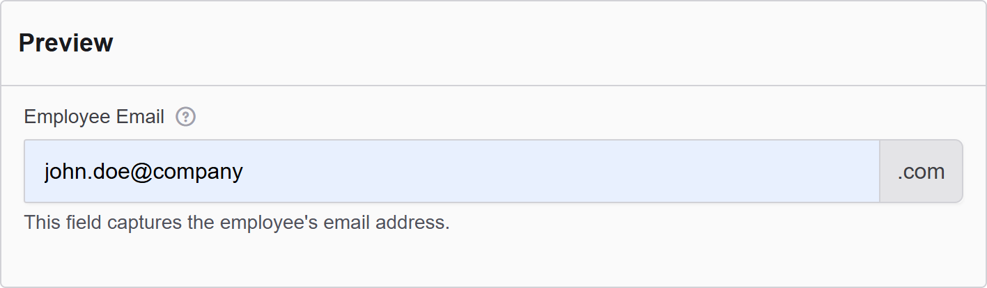
| Default Value | The Default Value will be the value for this field before user interaction. Having a default value will override the placeholder text. |
| Text Case | When data is entered, you can change the case of the value. For example: - Uppercase: Allows uppercase words only. - Lowercase: Allows lowercase words only. - Mixed: Allows a mix of both. |
| Truncate Multiple Spaces | Check the option not to allow multiple spaces to happen. |
| Clear Value When Hidden | When a field is hidden, clear the value. |
| User Component | Select the source user component to link this field to. |
| User Attribute | Select which user attribute will be displayed or stored (e.g., Username, Full Name, Email, Department). |
| Allow Manual Override of Calculated Value | Allow the user to manually override the value that was automatically populated. |
Validation
| Parameter | Description |
|---|---|
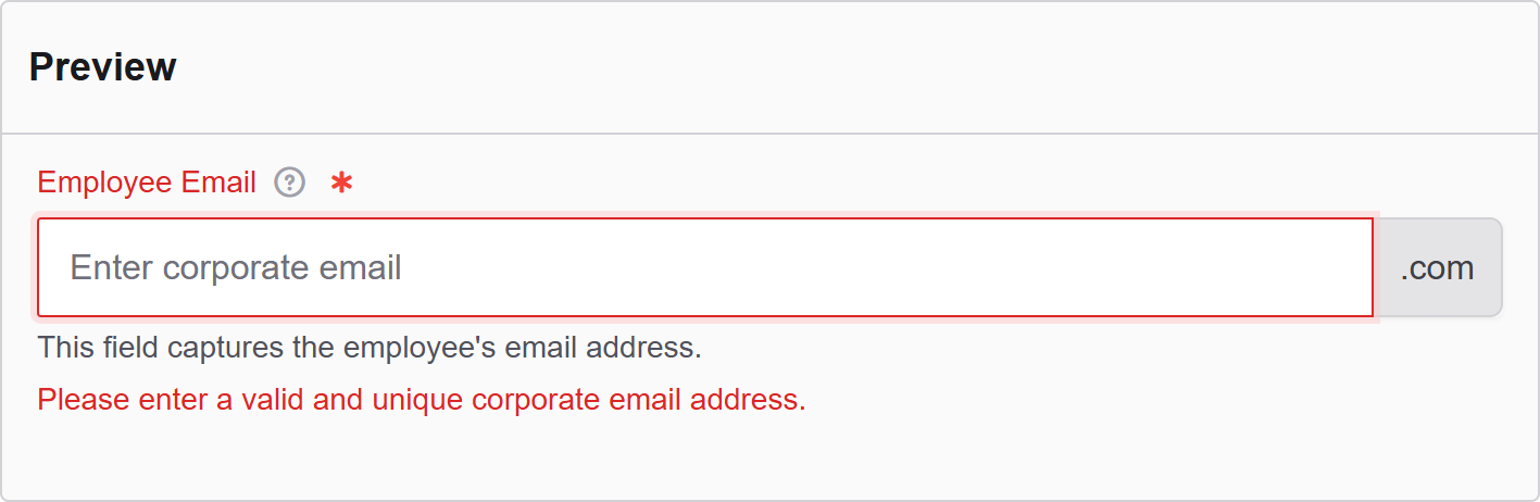
| Required | Check this to make this field as required. The user must fill it out before the form can be submitted. |
| Unique | Check this to ensure the data submitted for this field is unique and has not been submitted before. |
| Validate When Hidden | Check this to validate the component even when it is hidden/conditionally hidden. Validation errors are displayed in the error alert on the form submission. |
| Minimum Length | Enter a value to set the minimum length requirement for this field. |
| Maximum Length | Enter a value to set the maximum length requirement for this field. |
| Minimum Word Length | Enter a value to set the minimum amount of words that can be added to this field. |
| Maximum Word Length | Enter a value to set the maximum amount of words that can be added to this field. |
| Regular Expression Pattern | The regular expression pattern tests that the field value must pass before the form can be submitted. Example: x@xxx.com |
| Error Label | The label for this field when an error occurs. |
| Custom Error Message | Error message displayed if any error occurred. |
Conditional
| Parameter | Description |
|---|---|
| This Component should display | True - the component will display in the form. False - the component will not display. |
| When the form component | Select what component within the form will execute the condition. For example, Submit. |
| Has the value | The data entry of the field that executes the condition. |